At Local Projects, we thrive when designing for clients with big challenges, complex subject matter, and new paradigms. We’ve developed our approach to experience design by assuming a visitor first perspective. That means we listen carefully and design through the lens of the visitor rather than at the visitor.
Our Design Principles Part 1:
Tapping Into Emotion
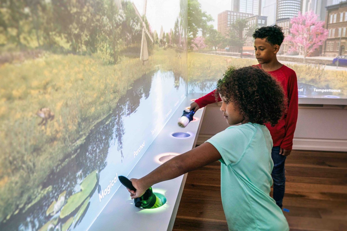
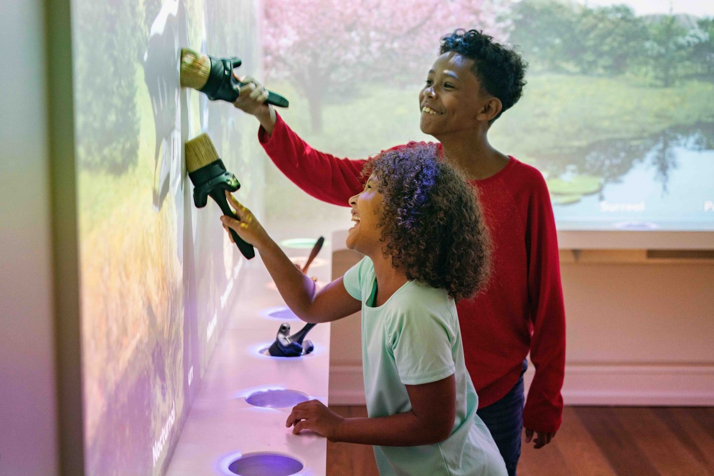
Our approach comes down to two simple principles:
EMOTION: Touch visitors’ hearts by connecting with them personally.
ENGAGE: Ask “what can visitors do?”
DESIGN PRINCIPLE #1: EMOTION
Storytelling enabled the collaborative creativity essential to our species survival. As a studio, we strive to create experiences that connect to our human need for narrative. By connecting with a visitor’s emotions, we strengthen the memory of their visit.
In today’s post we’ll cover two tactics we use to give our visitors more emotionally resonant experiences.
TACTIC #1: IMMERSIVE STORYTELLING
For an experience to be emotional, it needs to be stimulating, and to rise above the noise of everyday life. That’s why we use immersive visual design and digital media to activate visitors’ five senses.
Let’s look at two of our favorite examples:
London Mithraeum
Little is known about the Roman-era Cult of Mithras. What is known about this secretive cult of Roman soldiers has been gleaned from the thousands of Mithraic temples scattered throughout Europe, including one found at the site of Bloomberg’s London Headquarters.
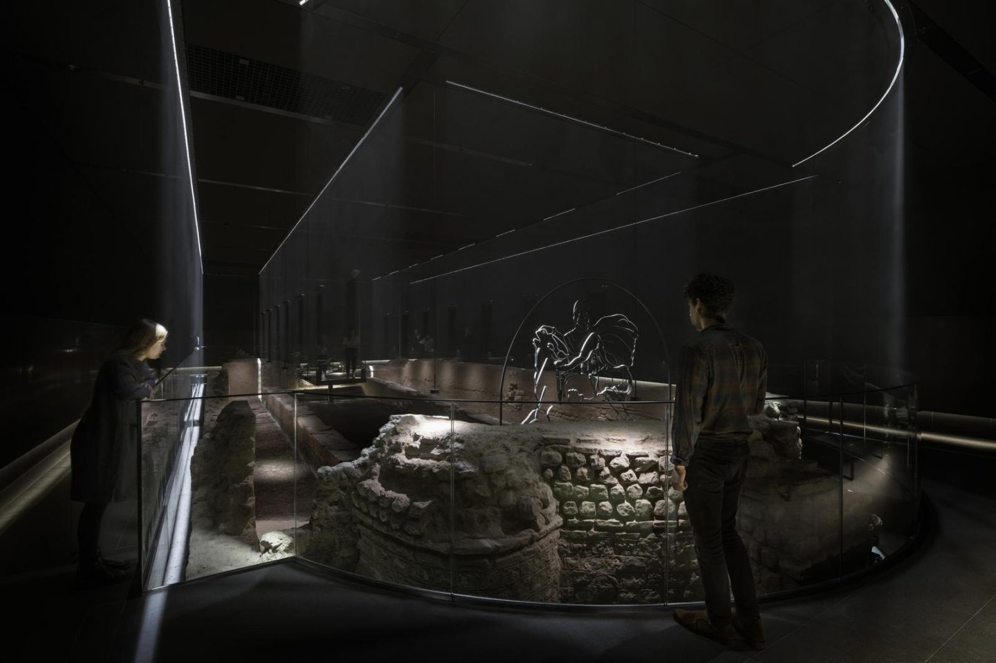
Example: If you have ever been inside a sacred space, you may have experienced that other worldly effect that those spaces can have. We’ve recreated that sensorial experience here by using what we know about the shape of the temple itself and the rituals performed there to carefully reconstruct the temple ruin with the Museum of London Architecture.
From there, we developed a one-of-a-kind lighting installation by pumping glycerol fog into the exhibit, and shining reinforced beams of LED light in the places where temple walls once stood – bringing the shape of the temple back to life as a ghostly hologram. Layered on top of this experience is a mysterious soundscape with the sound of shuffling boots, burning torches, and Latin chants that filled the temple thousands of years ago.
ZERO for the Guggenheim Museum Bilbao
Visitors to the Guggenheim Bilbao often have overwhelmingly positive reviews of the architecture and the site specific installations curated throughout the grounds and interior galleries. Many have wondered, how did this stunning institution come to be here by this river, in the Basque country? What was it like as a local to watch the city transform before their eyes over the past 20 years?
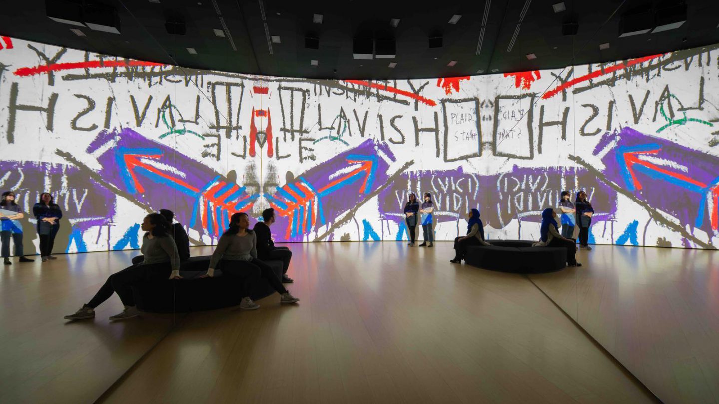
Within “Zero” we let you experience the story of how this magnificent place came to be and what has shaped its unique architecture. The Kaleidoscopic experience that utilizes the orientation gallery’s double-height space to create a 300-degree view to showcase scenes of industrial Bilbao before the museum existed, the highly innovative process of the Museum’s construction, and key works visitors will see inside.
To find a way to tell this story to Basque, Spanish, and English speaking visitors at the same time, we nixed a traditional spoken narrative, opting instead for an entirely visual narrative featuring a cinematic soundtrack featuring “Txalaparta”, a local woodblock instrument.
TACTIC #2: MAKE CONTENT PERSONAL + CONVERSATIONAL
We’re not afraid to employ bold, experimental tactics to get visitors’ attention, but sometimes the most powerful way to connect with a visitor is to pare down the visual stimulation and open up a dialogue.
One technique we have employed is allowing visitors a one-on-one interaction with real people or historical figures who share their lived histories rather than conveying the historical information via didactic panels. We have been incorporating this technique since our first project with StoryCorps, but today we have the advancement of technology to further enhance the personalization of the experience.
Hyde Park Barracks Museum
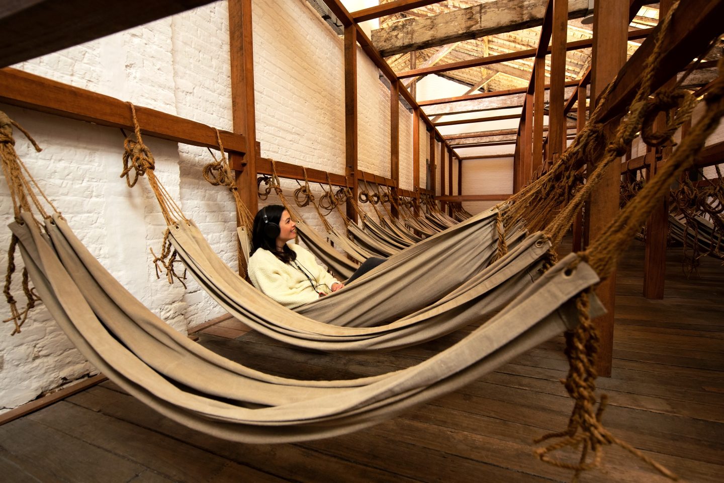
The Hyde Park Barracks Museum in Sydney is housed in one of the oldest buildings in Australia. It acted as the administrative hub for Britain’s transportation program, moving convicts to Australia as forced labor for building the colony. Local Projects was tapped to transform the Museum from a traditional historic institution into one that would weave together often conflicting or contentious narratives of the early colonization story, including the Aboriginal experience.
To share these varied historical perspectives, we looked to connect with the historic building and bring forth the hidden stories unearthed in this retelling. We did so by turning a traditional audio guide experience into a personal narrator. As visitors walk through one of Australia’s oldest buildings, visitor tracking technology delivers first-hand accounts of forcibly migrated convicts, immigrant women, Aboriginal people impacted by European settlement, and British soldiers.
Creating one-to-one interactions with historic figures also plays into our work with the Museum of the City of York on their first permanent exhibition, New York At Its Core. We’ll take a look at how and why that approach succeeded in future posts.
Thanks for reading, and tune in again soon for our next post on Design Principle #2, Engagement.

